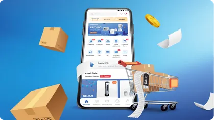
Making a broad home improvement catalog easier to explore
ACE Hardware is one of Indonesia’s largest home improvement and lifestyle retailers. Since opening its first store in Karawaci in 1996, the company has built a broad product range spanning household tools, home improvement items, lifestyle products, and everyday solutions.
That breadth is a commercial strength, but it also creates a digital challenge. Customers may visit the website with a specific need, such as finding a tool or solving a household problem. Others may browse for ideas. In both cases, the website must help users move through a large catalog without making the experience feel crowded or confusing.
Suitmedia worked with ACE Hardware to redesign the website around an e-commerce experience. The new approach made products easier to find, promotions easier to understand, and practical content easier to explore. The website was designed not only as a digital brochure, but also as a sales-support platform that could guide customers from discovery to purchase consideration.
A large assortment needed stronger digital direction
1. Product breadth had begun to create complexity
ACE Hardware’s wide range of products gave customers many choices. But online, a large assortment can quickly become difficult to navigate when users do not know where to begin.
A customer searching for a specific product needs a fast route to the right category or result. A customer browsing more generally needs enough structure to discover relevant products without scrolling through an unorganized list.
The website therefore needed to manage two opposing needs: give customers access to the full product range while keeping the journey simple enough for quick decisions.
2. The website had to support more than brand awareness
ACE Hardware wanted the website to attract visitors through engaging content, strong imagery, and a visually appealing homepage. But the platform also needed to support commercial outcomes.
A website that simply presents products may create awareness without helping users move toward a purchase. Customers need to understand what is available, how products relate to their needs, and what action to take next.
The website had to operate as a digital sales representative. It needed to introduce products, answer early questions, highlight relevant promotions, and provide a clear path into deeper product exploration.
3. Different visitors arrived with different intentions
Some users would arrive with a specific product in mind. Others might be browsing for inspiration, looking for a solution to a household problem, or exploring a current promotion.
These visitors could not all be served through the same entry point. A single large promotional image might attract attention but would not necessarily help a user find a particular product.
The design needed to provide several clear routes into the experience: search, categories, promotions, product details, and useful content.
4. Product discovery needed to be fast and understandable
When a customer is shopping for a practical item, they may be looking for an immediate answer. They do not want to understand the retailer’s internal catalog structure before finding the product they need.
The website therefore needed clear navigation and a prominent search experience. Users should be able to start with a product name, a category, or a practical need and move toward relevant options.
Reducing search effort was important because every additional moment of uncertainty increases the chance that a visitor will leave or look elsewhere.
5. Product information needed to create confidence
A product listing alone is rarely enough for home improvement and lifestyle purchases. Customers may need to understand the product’s use, features, suitability, or relationship to a specific household need.
Product detail pages needed to provide a more complete basis for consideration. The website had to help users decide whether an item was relevant before they moved further into the buying process.
This made content a central part of the e-commerce experience. Clear product information was not an optional addition to the design; it was part of how the website could support conversion.
6. Promotions needed to create more than one entry point
Promotional content could attract customers and support sales, but presenting only one large banner would limit the number of offers users could discover.
ACE Hardware needed a promotional structure that could show multiple offers without overwhelming the page. Customers should be able to understand what was available and choose which promotion was most relevant to them.
The challenge was to create visibility without turning the homepage into a crowded advertising board.
7. The brand needed a stronger reason for customers to stay
A product-focused website can answer a direct question, but it may not create deeper engagement. ACE Hardware also wanted the website to provide useful and inspiring content related to everyday home activities.
Content such as Home DIY, Daily Solution, and Do & Don’ts could help users solve problems and learn new ways to use products.
This gave the website a broader role. It could serve customers who were not yet ready to buy but were looking for practical ideas or guidance.
8. Visual appeal had to support usability
ACE Hardware wanted an engaging and graphically pleasing homepage, but visual impact could not come at the expense of clarity.
Too many visual elements can compete for attention and make it harder to distinguish products, promotions, and navigation. The design needed to use imagery and color to create interest while maintaining a clear hierarchy.
The goal was to make the website feel active and useful without making it feel busy.
Designing the website around how customers shop
1. Use an e-commerce structure as the foundation
Suitmedia chose an e-commerce-based design because customers were likely to arrive with a product-related intention. They might be browsing, researching, or looking for something they needed urgently.
This approach gave the website a clear commercial structure. Products became the central point, while content and promotions supported discovery and consideration.
The decision also helped ensure that the site was organized around customer actions rather than only around corporate communication. Users could move naturally from finding a product to understanding it and exploring related options.
2. Make search a primary starting point
The new website highlighted the search bar as an important part of the experience.
Search helps customers with precise intent move quickly toward a result. But the search field also needed to feel approachable, so engaging language was used to make the interaction more comfortable.
This reduced the sense that the search bar was a technical tool. It became a natural invitation for customers to begin exploring the ACE Hardware catalog.
3. Use categories to support broader browsing
Not every customer knows the exact name of what they need. Some users begin with a product category, a room in the house, or a general area of interest.
The website used a left-side navigation structure to show product selections more clearly. This gave users a visible overview of the catalog and helped them move through categories without guessing.
A clear category system also supported discovery. Customers could encounter products they had not specifically searched for but that were relevant to their broader need.
4. Combine search and navigation rather than choosing one
Search and category navigation serve different behaviors. Search is efficient for specific intent, while navigation supports exploration and comparison.
The design included both so customers could choose the path that matched their situation. A user looking for a particular item could search directly, while another looking for home solutions could browse through categories.
This flexibility helped the website serve a broader range of customers without making the experience more complicated.
5. Make product details central to the journey
Product detail was treated as a key part of the website experience.
Once a customer selected a product, they needed access to information that could support further consideration. This helped bridge the gap between a product image and a confident decision.
A strong detail page also created opportunities to connect products with related content, promotions, or practical solutions. The product could be presented not only as an item for sale, but as a response to something the customer wanted to do.
6. Use multiple promotional banners with clear hierarchy
The promotion section included more than one banner, allowing ACE Hardware to highlight several offers at once.
Different banner sizes created a visual hierarchy. A primary promotion could receive greater emphasis, while smaller promotions remained visible without competing equally for attention.
This increased the number of opportunities for customers to discover relevant offers while preserving a structured homepage.
7. Use red and white to reinforce brand recognition
The website used red and white as its main colors, aligning the interface with the ACE Hardware corporate identity.
This helped create continuity between the website and the existing brand. Customers familiar with ACE Hardware could recognize the digital environment as part of the same organization.
The color system also supported hierarchy and action. Used deliberately, brand colors can draw attention to important navigation items, promotions, or calls to action without requiring excessive decoration.
8. Use imagery to make products easier to imagine
Visual presentation was important because ACE Hardware sells products that customers often evaluate through appearance and practical use.
Clear imagery could help users understand the product at a glance and decide whether to explore further. Strong images also made the website more engaging for customers who were browsing rather than searching for one specific item.
The use of visuals therefore served both emotional and functional purposes. It made the catalog more attractive while improving product recognition.
9. Add Home DIY content to support action
Home DIY content gave customers ideas and guidance for improving or maintaining their homes.
This content helped ACE Hardware participate earlier in the customer journey. A user might begin with an idea or problem rather than a product search, then discover relevant products through the content.
The feature also connected the retailer with practical expertise. ACE Hardware could help customers understand not only what to buy, but how to approach a project.
10. Use Daily Solution content to address everyday problems
Daily Solution content focused on practical needs that customers encountered in daily life.
This provided a useful entry point for users who were looking for answers rather than products. Once the problem was understood, the website could guide them toward relevant categories or items.
The structure reflected an important retail principle: customers often shop to solve something. Helping them define the solution can make product discovery more relevant.
11. Add Do & Don’ts content to build confidence
Do & Don’ts content could help users avoid mistakes and understand better ways to complete household tasks.
This kind of guidance can increase customer confidence, particularly for people who are less experienced with home improvement or maintenance.
It also created a more trustworthy relationship with the brand. ACE Hardware was not only promoting products; it was helping users make better decisions around their use.
12. Connect inspiring content with the product range
Useful content had the greatest commercial value when it could lead naturally to relevant products.
Home projects, daily solutions, and practical advice could all create opportunities for users to explore items connected to the issue they were trying to solve.
This connection avoided separating content from commerce. The website could inspire customers while still supporting a clear path toward product consideration.
13. Use the homepage as a decision center
The homepage brought together search, product categories, promotions, and content.
This made it a starting point for different types of users. Customers with immediate intent could search or browse products, while customers looking for ideas could explore promotions or practical content.
The homepage therefore served more than a branding function. It helped route users toward the part of the website most relevant to their current need.
14. Design the platform to support future digital growth
The e-commerce structure created a foundation for future improvements in product discovery, content, promotions, and commerce functions.
As ACE Hardware’s digital presence developed, the platform could support additional customer journeys without abandoning the basic structure that made the site understandable.
This gave the company room to grow while protecting the core user experience.
A product-led website created more room for discovery and sales
1. ACE Hardware gained a stronger digital storefront
The redesigned website presented ACE Hardware’s product range through a more structured and visually engaging experience.
It functioned as more than an online brochure. Customers could search, browse categories, explore product details, discover promotions, and access useful content.
This gave ACE Hardware a stronger digital presence that could support both marketing and sales activity.
2. Customers had clearer ways to find products
The combination of search, left-side category navigation, and organized product presentation made it easier for users to move through the catalog.
Customers could choose between direct search and broader exploration based on their needs. This reduced the effort required to find relevant products.
A clearer discovery process also increased the likelihood that customers would explore beyond their first result and encounter related products or solutions.
3. Product information became more central to consideration
The website emphasized product details so customers could evaluate items more confidently.
This supported the sales funnel by helping users move from awareness to consideration. Customers did not need to rely only on a product image or leave the site to search for additional context.
The result was a more complete digital shopping experience, even for customers who were still early in their decision process.
4. Promotions gained more visibility
The updated promotion section allowed ACE Hardware to communicate several offers in a structured way.
This created more opportunities for customers to notice relevant promotions and connect them with product categories or purchasing decisions.
The multi-banner approach also helped the website remain commercially active without making one offer carry the entire burden of attracting attention.
5. The brand became more useful beyond the transaction
Home DIY, Daily Solution, and Do & Don’ts content helped ACE Hardware provide value before and after a purchase decision.
Customers could learn, plan, and gain confidence. The website became a source of ideas and practical support rather than only a place to see products.
This strengthened the brand’s position as a home improvement and lifestyle partner. The company could be useful even when a customer was not yet ready to buy.
6. Content created more reasons to return
Product catalogs may change, but practical content can create an ongoing relationship with customers.
New DIY projects, household solutions, and educational pieces can give visitors additional reasons to revisit the site. Each visit creates another opportunity to discover products and remain familiar with ACE Hardware.
The second-order effect is greater engagement over time. The website becomes a continuing source of inspiration rather than a one-time product lookup tool.
7. The platform supported stronger commercial potential
The combination of product-led navigation, promotions, detailed information, and useful content created better conditions for traffic, conversion, and sales growth.
While the case study does not provide proprietary performance figures, the design directly addressed the main drivers of e-commerce effectiveness: findability, clarity, confidence, and a visible path toward purchase.
The website became better equipped to convert interest into action without compromising the broader customer experience.
8. ACE Hardware gained a more adaptable digital foundation
The e-commerce structure could support future improvements in content, product management, and customer journeys.
This created flexibility for ACE Hardware as its digital expectations and product range continued to evolve. The company could add new forms of engagement while keeping the central shopping experience familiar.
The result was not only a redesign, but a stronger base for ongoing digital transformation.
The deeper lesson: large catalogs need guidance, not more noise
1. More products create more need for structure
A large assortment can attract customers, but only when the website helps them understand how to navigate it.
Clear search, categories, filters, and content pathways turn variety into useful choice. Without structure, assortment becomes overload.
2. Retail websites should serve both urgency and curiosity
Some users arrive with a specific need. Others want inspiration or are still defining the problem they want to solve.
A strong e-commerce experience supports both. Search helps with urgency, while categories and practical content support exploration.
3. Content can create demand by helping people define a need
DIY and daily solution content can introduce customers to projects or problems they had not yet translated into a product search.
This makes content commercially valuable without turning it into direct advertising. It helps customers understand what they want to do, then guides them toward the products that can help.
4. Visual hierarchy is a business tool
Large images, clear banners, white space, and consistent color help users decide what deserves attention.
Good visual hierarchy reduces confusion and improves the chance that customers notice important products, promotions, and actions.
5. A product detail page should answer the next question
Customers rarely need only a product name. They may want to know how an item works, whether it suits their project, or what alternatives exist.
Useful product information helps customers continue their decision. The more uncertainty the page removes, the stronger its contribution to conversion.
6. Digital retail should support the entire customer decision
Customers may discover an idea, search for a product, compare options, read guidance, and respond to a promotion before they buy.
A successful platform connects these stages instead of treating them as separate experiences. ACE Hardware’s redesign created a clearer path across the full decision process.
Strategic Insights for the C-Suite
- Make product discovery the organizing principle of a large catalog. Customers should be able to search, browse, and explore based on their own intent. Structure turns assortment into useful choice.
- Use content to help customers define and solve problems. DIY guidance and practical solutions create value before purchase and can lead customers toward relevant products naturally.
- Balance commercial visibility with user clarity. Promotions and product highlights should be prominent, but not so numerous that they compete with navigation and comprehension. Attention must be directed, not simply demanded.
- Treat product information as part of the sales funnel. Clear details reduce hesitation and help customers progress from interest to consideration. Content quality directly affects commercial potential.
- Build e-commerce platforms for continued learning and expansion. Customer needs, products, and digital behavior will change. A clear foundation allows the retailer to add new content and capabilities without making the core journey more complex.