Challenge: How to make a website that can attract new users and millennials?
Mandiri Sekuritas is one of the securities companies that have been licensed as a stock broker since 1992. This company has also been registered and is under the supervision of the Financial Services Authority or OJK. Thanks to the sophistication of technology, investing in stocks is now easier. All of the investment activities can be done online, likewise, investing through Mandiri Sekuritas online by using their new service called MOST. MOST or Mandiri Online Securities Trading, is an online platform that offers solutions for buying and selling stocks, mutual funds and bonds owned by Bank Mandiri.
Many choose to redesign their website to welcome more traffic as their business grows and scales. Just like MOST, they want to reach broader audience and attract more new users as well. They aim the millennials as their main target, because those born in the 1980s to 1997 are very dependent on technology and mostly are aware of impact investment. As a big company, MOST already has a website with a lot of features displayed both on the main web page and on each of its sub-pages, but with this, website cannot function properly for the user. As a securities website, MOST has quite complex content and ineffective features and makes users confused. With those concerns, we have to bring this website back to life to get through the goals.
Solution: An organized, functional and attractive all-in-one website
Having a website for business owners of any size has become crucial. Knowing the importance of a website is the key to grow a business many folds. However, how important is your website design? When users were asked to describe why they didn't trust a website, 94% of the comments were directly related to the site's design. A well-built website generates better customer traffic and an improved user interface leads to increased conversions. To be able to reach the goal, we have to revamp the MOST website with these aspects:
Trendy and attractive UI/UX Design
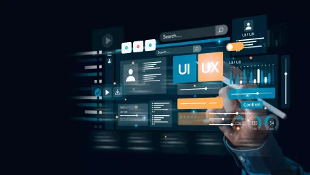
We decided to implement the design trends in order to attract the millennial and new users. Such as: add empty spaces, it’s important to give some space to let the message sink. Insert some visuals like videos, pictures, graphics, because those elements are stronger than words. The important part for this project is we sorted out all the menus in some organized sections, and it makes the website’s features accessible and not confusing. We also provide a familiar app-like experience when using search engines and browsing websites. Lastly, we create a storytelling-design. To make it more attractive, we wrap the design with a color palette that is derived from brand color and visual elements: blue, yellow, white, gold, grey, and black.
Create new important feature
To create new feature to a website is practically required for businesses that want to remain relevant in their industry. Companies that hope to not just survive, but thrive in the market need to integrate new design trends, unique elements, and innovative technology. In this is the all-in-one website, we decided to add new feature called “APLIKASI” to give users a quick and easy access to download the mobile app (MOST Mobile) or the desktop app (MOST Desktop App), this feature is totally functional especially for the new users.
Conclusion: A fully functional website for users
The overall advantages to revamp this website are to increase the search engine, user experience, customer satisfaction, usability, and reach broader audience. With all the features, fresh look and well-organized website, the users will stay longer in it and will never get out. As a result, MOST website successfully gain more than 108k visitors with more than 705k pageviews. May this new look could help to reach their goals.

