
Making a trusted halal retailer easier to discover and visit
TIP TOP is an Indonesian department store known for selling halal food and household goods. It had an established retail presence, but its digital identity did not yet reflect the value of the business or make it easy for customers to understand what the store offered.
The existing website looked outdated, was difficult to navigate, and did not work well on mobile devices. This limited Tiptop’s ability to communicate promotions, product information, store locations, and membership benefits to customers who increasingly began their shopping journeys online.
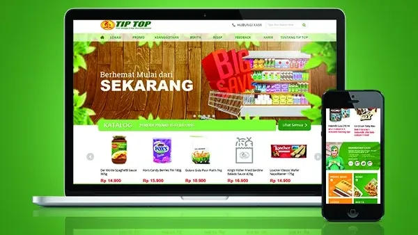
Suitmedia redesigned the website around a simple business objective: make Tiptop easier to understand, easier to use, and more useful before a customer visits a store. The result was a cleaner, mobile-friendly platform that supported brand awareness, customer loyalty, and offline retail visits.
A strong physical presence needed a better digital introduction
1. Tiptop was known by some customers, but not visible enough online
Tiptop had a clear retail position, particularly through its focus on halal food and goods. However, its brand awareness remained lower than that of some competitors.
A physical store can communicate through its location, signage, product displays, and staff. A website has to create that first impression differently. It must explain what the retailer stands for, what customers can find there, and why they should consider visiting.
Tiptop’s digital presence was not doing that effectively. The website was not strong enough to introduce the brand to new customers or reinforce the relationship with existing ones.
2. The existing design was creating unnecessary friction
The previous website was outdated and poorly organized. Even when the right information existed, users could struggle to find it or understand how different pages were connected.
This matters because customers rarely separate a website experience from the brand itself. If the site feels difficult to use, visitors may assume that the company is less current, less attentive, or less relevant than competitors with more polished digital experiences.
The problem was therefore more serious than visual appearance. Poor structure was making it harder for customers to access information that could influence a store visit.
3. Mobile use had become essential
The existing website was not mobile-friendly. This limited access for users who encountered Tiptop while browsing on their phones.
Mobile users often have less patience for unclear navigation or layouts that require constant zooming and scrolling. If the site does not work naturally on a smaller screen, users may leave before learning about a promotion, product, store location, or membership benefit.
A mobile-friendly experience was therefore necessary not only for convenience, but for continued relevance. The website needed to work in the same environments where customers were already searching and making shopping decisions.
4. Retail information needed to support action
Tiptop wanted the website to support offline sales through promotional highlights, product catalogs, store locations, and membership card benefits.
These were all commercially valuable, but only if users could find and understand them quickly. A promotion that is difficult to locate has limited influence. A store locator that is hard to use cannot effectively bring customers into stores.
The website needed to connect information with the next customer action: explore an offer, check a product, find a store, or understand the value of becoming a member.
5. A redesign had to balance visual appeal with usability
Tiptop wanted a more attractive and effective digital presence. But a visually impressive site could still fail if it remained difficult to navigate.
The project therefore required balance. The website needed a modern visual identity, but design decisions had to support clarity, speed, scanning, and mobile use.
The goal was not to decorate the existing structure. It was to rebuild the experience around how customers find information and decide what to do next.
6. The site had to reflect Tiptop’s distinctive position
Tiptop’s focus on halal products and goods gave it a meaningful point of difference. The new website needed to make that position visible without turning the entire experience into a long corporate explanation.
The brand’s identity had to appear through content, organization, and presentation. Customers should be able to understand what made Tiptop relevant and why its product selection deserved attention.
This was especially important in a competitive retail environment. A clear digital position can help a retailer become more memorable before customers make a physical visit.
7. The website needed to strengthen the link between digital and physical retail
Tiptop’s commercial model remained centered on its stores. The website was not intended to replace the offline experience; it was intended to support it.
That meant the site needed to prepare customers for store visits. It could highlight promotions, provide product information, show locations, and explain membership benefits.
The strategic opportunity was to make the website a useful step before the store rather than a separate communication channel with no connection to the physical business.
Designing a clearer route from information to store visit
1. Begin with information architecture, not visual styling
Suitmedia first focused on organizing the website’s content and defining what should be prioritized.
Information architecture determines how users understand a website. It answers practical questions: What belongs together? What should appear first? Which pages require prominence? How should users move from one category to another?
This work created the foundation for the visual redesign. Without a clear structure, a modern interface would only make a confusing website look newer.
2. Define a clear hierarchy for key content
The new structure prioritized the information customers were most likely to need. Promotional highlights, product catalogs, store locations, and membership benefits were treated as important parts of the customer journey.
This helped align the website with Tiptop’s business goals. The site was not organized only around internal departments or company information; it was organized around what could help customers decide to visit and shop.
A clear hierarchy also reduced cognitive effort. Users could recognize which options mattered most without scanning every page.
3. Use primary and secondary navigation deliberately
Suitmedia translated the information architecture into primary navigation menus and a secondary menu for less prominent pages.
This allowed the website to remain comprehensive without placing every link at the same level of importance. Core customer needs remained visible, while supporting information was still accessible when required.
The distinction helped maintain focus. Users were not forced to choose from a long and undifferentiated list of pages.
4. Design around user intent rather than internal structure
Customers do not necessarily think in terms of Tiptop’s internal organization. They may arrive with a specific purpose: find a promotion, browse a product category, locate a store, or understand membership benefits.
The navigation was designed to support these intentions. This made the website more intuitive because users could approach it through the task they wanted to complete.
The principle is simple: a retailer should organize its digital experience around how customers shop, not only around how the company is structured internally.
5. Create a clean and modern visual system
The redesigned website used a clean design with fewer unnecessary elements.
A cleaner layout made important content easier to see and reduced the visual noise that can make a website feel outdated. It also helped Tiptop communicate a more current and credible identity.
The design supported the brand without competing with the information customers needed. Visual appeal came from clarity, spacing, consistency, and purposeful presentation rather than decoration alone.
6. Use simplicity to improve speed
Simple design can improve performance because it often requires fewer visual assets and less complex page structure.
This mattered for users accessing the website through mobile networks or devices with limited processing power. Faster loading reduced the likelihood that visitors would leave before the page became usable.
Speed also affected perception. A website that responds quickly feels more reliable and considerate of the customer’s time.
7. Make content easier to scan
The redesign reduced complicated decorative elements and created a more scannable content experience.
Customers could identify headings, promotions, categories, and calls to action more quickly. This was particularly useful for visitors who were not reading the entire page but looking for one specific piece of information.
Scannability helped the site serve both quick browsers and more engaged users. People could find an immediate answer while still having the option to explore further.
8. Make promotional content more visible
Promotion highlights were included to connect the website with current retail activity.
This gave customers a direct reason to visit the site and helped Tiptop communicate offers more effectively. Promotions can influence store traffic, but only when customers can discover them in time and understand their relevance.
The redesigned experience made promotional communication a more visible part of the customer journey rather than a secondary detail.
9. Use the product catalog to support discovery
The product catalog gave users a way to explore what Tiptop offered before visiting a store.
This was valuable for customers who wanted to plan their shopping or confirm that Tiptop carried relevant categories. It also helped the retailer present the breadth of its products in a structured digital environment.
The catalog supported both awareness and confidence. Customers could become familiar with the range before making a physical visit.
10. Make store location information actionable
A store locator connected digital discovery directly to offline action.
Customers could use the website to understand where Tiptop stores were located and decide which one was most convenient to visit. This reduced the effort required to turn online interest into a physical trip.
The feature also reinforced the role of the website as a retail support tool. Its value was measured not only by time spent online, but by how effectively it helped customers reach the store.
11. Explain membership benefits clearly
Membership card benefits were included to help customers understand the value of joining Tiptop’s loyalty program.
Clear explanation is important because customers may not sign up for a program if the benefits are vague or difficult to find. The website could use this content to strengthen retention and encourage repeat visits.
Membership information also supported a longer-term relationship. It gave customers a reason to remain connected to Tiptop beyond one transaction.
12. Build for desktop and mobile from the start
The new website was designed to work fluidly across desktop and mobile devices.
Responsive design ensured that the structure, content, and navigation remained usable regardless of screen size. Customers could access promotions, product information, store locations, and membership details through the device available to them.
This reduced the risk of creating two different brand experiences. Tiptop could present a consistent identity whether customers discovered it at home or while moving through their daily routines.
13. Connect user experience with offline commercial goals
Every major feature was linked to a practical retail outcome. Promotions could encourage visits. Product information could support consideration. The store locator could help customers reach a location. Membership information could encourage repeat engagement.
This made the website more than a brand presentation. It became part of Tiptop’s retail operating model.
The platform helped connect customer attention online with commercial activity offline, creating a clearer role for digital within the wider business.
14. Use the redesign to strengthen brand recognition
A more current visual identity and clearer content structure gave Tiptop a stronger way to express what it offered.
Recognition develops when customers repeatedly encounter a brand in a consistent and understandable form. The redesign created a digital environment that could support that repetition.
Over time, a stronger online presence could help Tiptop become more visible in the consideration stage, especially among customers comparing retailers digitally.
A more useful website helped support store traffic and loyalty
1. Tiptop gained a stronger digital foundation
The redesigned website gave Tiptop a more attractive, organized, and mobile-friendly presence.
This improved the company’s ability to communicate with customers outside the physical store. Visitors could learn about the brand, explore its products, and understand how to engage with its retail network.
The website became a more credible reflection of the business and its market position.
2. Customers could find key information with less effort
The new information architecture and navigation helped users find promotions, product catalog content, store locations, and membership benefits more easily.
This reduced friction at the beginning of the customer journey. Users did not need to understand the company’s internal structure to access the information they wanted.
A more direct experience also supported customer confidence. When information is easy to find, the brand appears more organized and dependable.
3. The site supported offline sales activity
The website was designed to support customers before they visited Tiptop stores.
Promotions could create interest, product content could support planning, and store location information could help users decide where to go. These features created a practical bridge between online attention and offline shopping.
The result was a more connected retail experience. Digital activity could contribute to store visits rather than existing separately from the physical business.
4. Tiptop became more accessible on mobile
Mobile-friendly design expanded the circumstances in which customers could interact with the brand.
A shopper could check a promotion while commuting, look up a store location while planning a visit, or browse product information from home. The website no longer depended on customers using a desktop computer.
This increased the potential reach of Tiptop’s digital communication and helped the brand remain present throughout the customer journey.
5. The visual refresh supported stronger brand awareness
The modern and clean design helped Tiptop present itself more consistently with current digital expectations.
A stronger first impression can influence whether a new visitor continues exploring and whether an existing customer sees the brand as current and reliable.
The redesign therefore supported more than usability. It helped Tiptop express a clearer, more competitive digital identity.
6. Membership information supported customer loyalty
By making membership card benefits easier to understand, the website could encourage more customers to consider joining and using the program.
Loyalty depends partly on the quality of the benefit, but also on whether customers understand and remember it. Clear online communication can help turn a membership program into a more visible part of the retail relationship.
Over time, this can support repeat visits and a stronger sense of value among existing customers.
7. Tiptop gained a platform for future communication
The website’s structure could support future promotions, product updates, store information, and loyalty communication.
This gave Tiptop a more durable channel for engaging customers. The company could continue developing the platform rather than treating the redesign as a one-time response to an outdated site.
The second-order effect was greater digital readiness. Tiptop had a stronger base from which to respond to changing customer behavior and retail competition.
8. The redesign improved the connection between experience and performance
A website redesign is most valuable when it improves what customers can do and how the business can support them.
Tiptop’s new platform made key information more accessible, reduced mobile friction, and connected digital content to offline retail goals. These improvements created better conditions for awareness, loyalty, and store visits.
The work demonstrated that a clearer user experience can support commercial performance without requiring the website to become complicated or overly promotional.
The deeper lesson: retail websites should help customers decide what to do next
1. A website should guide action, not simply display information
Customers visit retail websites with different goals. Some want to browse, others want a promotion, and others need a store location.
A strong platform recognizes these goals and creates clear next steps. Information becomes more valuable when it helps users move toward a decision.
2. Navigation is part of brand trust
Customers interpret a disorganized website as a sign of a disorganized business. Clear structure communicates that the company understands its customers and respects their time.
For established retailers, navigation quality can influence whether legacy trust carries into the digital environment.
3. Mobile usability is now part of basic accessibility
If a website is not usable on mobile, a significant portion of the audience may never experience the brand properly.
Responsive design protects access and ensures that digital communication is available in the contexts where customers increasingly search and decide.
4. Clean design supports both comprehension and performance
A simpler page can be easier to scan, faster to load, and more credible to use.
The value of minimalism is practical. It helps customers see what matters and reduces the technical burden of delivering the experience.
5. Retail content should be tied to real customer behavior
Promotions, catalogs, store locators, and membership benefits are not isolated information categories. Together, they support a customer’s path from discovery to store visit and repeat engagement.
The most useful retail websites are built around these transitions rather than around content for its own sake.
6. Digital and offline retail must reinforce one another
A department store’s website should help customers understand, plan, and act. When the platform connects online information with physical locations, digital becomes a driver of the wider retail relationship.
This creates a more resilient business model, especially as customers move fluidly between screens and stores.
Strategic Insights for the C-Suite
- Use digital redesign to remove customer effort, not only update appearance. A modern look matters, but clearer navigation and faster access to useful information create the stronger business value.
- Organize retail content around the customer’s next action. Promotions should lead to visits, catalogs should support consideration, and store locators should make physical access easier. Every major content area should have a practical role.
- Treat mobile usability as a requirement for market relevance. Customers increasingly discover and evaluate retailers through phones. A poor mobile experience can weaken awareness before the customer ever reaches the store.
- Connect digital performance to offline outcomes. For store-based retailers, website value includes more than online traffic. Consider whether the platform helps customers visit stores, use promotions, join loyalty programs, and return.
- Build websites as ongoing retail infrastructure. Customer behavior and commercial priorities change continuously. A clear structure and manageable content system make it easier to maintain relevance after the redesign launches.