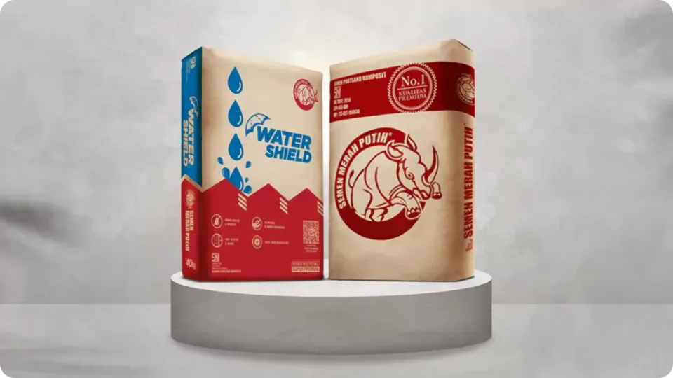

Semen Merah Putih is the cement brand of PT Cemindo Gemilang, a manufacturer of bulk cement, concrete cement, and Portland Composite Cement (PCC).
Established in 2011, the company has built its reputation around premium-quality products and modern manufacturing facilities. Its products support a wide range of construction needs, from residential projects to industrial buildings, large-scale developments, and manufacturing facilities.
However, the website was not helping users understand that range. High bounce rates suggested that visitors often arrived on a page but did not continue exploring. Product information was difficult to access, and the interface did not make it easy for users to identify which cement solution suited their project.
Between 2023 and 2024, PT Cemindo Gemilang partnered with Suitmedia to revamp the Semen Merah Putih website. The project focused on simplifying navigation, organizing product information, improving the user interface, and creating a clearer path from product discovery to construction decision-making.
A Strong Product Portfolio Was Creating Too Much Search Effort
1. The website was not reflecting the strength of the product range
Semen Merah Putih offered products for different construction applications, but the website did not present that range in a way that was easy to understand.
A visitor might be looking for cement for a home, a commercial building, a large infrastructure project, or an industrial facility. Each use case may involve different product requirements, performance considerations, and technical expectations.
The company needed a website that could show the breadth of its portfolio without forcing every visitor to review the same information.
A strong product range creates value only when customers can identify which products are relevant to them. The website had to make that connection clearer.
2. High bounce rates signaled a relevance problem
The existing website recorded high bounce rates. Visitors were arriving, viewing a page, and leaving without exploring other parts of the website.
This can happen for several reasons. Users may not find the information they expected, may be unsure where to go next, or may encounter a layout that does not clearly communicate the site’s value.
For Semen Merah Putih, the issue was more than a performance metric. It suggested that the website was not effectively helping visitors continue their research.
If users could not find product information quickly, they might abandon the site before learning about the company’s solutions or considering a product.
3. Product information was difficult to access
Cement is a technical product. Users may need to review specifications, benefits, applications, and suitability before making a decision.
The existing user experience made that process more difficult than necessary. Product information was not organized in a way that helped visitors quickly identify what mattered to them.
This created a gap between the information Semen Merah Putih had and the information users could practically use.
A website can contain complete product descriptions but still fail to support decision-making if users cannot find, compare, or interpret them easily.
4. The main audience needed guidance, not only product listings
Semen Merah Putih’s key audiences included builders, architects, and building consultants.
These users often influence product selection for clients or construction projects. They may need technical detail, but they also need a fast way to connect product features with a particular application.
They may be asking:
- Which product is suitable for residential construction?
- Which option fits an industrial building?
- What product should be considered for large-scale construction?
- What benefits and specifications matter for a particular project?
A simple product list would not answer these questions effectively. The website needed to guide users from their construction need to a relevant product category.
5. A poor digital experience could weaken confidence in the brand
Construction professionals often evaluate suppliers through multiple signals, including product quality, technical credibility, reliability, and ease of access to information.
An outdated or confusing website can weaken confidence before a direct conversation begins. If users struggle to understand the product range, they may also question how easy it will be to work with the company.
Semen Merah Putih needed a digital experience that reflected the quality and modernity of its manufacturing capabilities.
The website had to communicate that the brand was not only producing premium cement, but also prepared to support customers with clear and reliable information.
6. The platform needed to support both discovery and deeper research
Some visitors would arrive with a general interest in Semen Merah Putih. Others might already know the type of cement they were looking for.
The website needed to serve both groups.
New visitors required a clear introduction to the product portfolio and its applications. More experienced users needed a quick route to specifications, benefits, and detailed product information.
This required a layered experience. The first level needed to be simple and accessible, while deeper information had to remain available for users who needed to evaluate a product more seriously.
Designing the Website Around Construction Decisions
1. We began with user needs rather than internal product structure
Suitmedia’s approach focused on how visitors would use the website to make construction-related decisions.
Instead of organizing the platform only according to internal product groupings, the experience was structured around the questions users were trying to answer.
This shifted the design from a product-centered catalog toward a user-centered information system.
The goal was to help visitors move through a clear sequence:
- Identify their construction application.
- Explore relevant product categories.
- Review product details and benefits.
- Determine which solution best fits their needs.
- Continue toward inquiry or further engagement.
This sequence reduced the effort required to understand the portfolio.
2. We created clearer product categories
The revamped website organized products into categories that were easier for users to understand.
The categories reflected different construction needs, including residential and industrial buildings, large-scale construction, manufacturing, and other applications.
This helped visitors begin with the context they knew best. A builder or consultant may not remember a product name, but they are likely to know the type of project they are working on.
Starting with application made product discovery more intuitive. Users could narrow their search based on the project before reviewing specific cement options.
3. We connected products to practical applications
Each category was designed to explain how Semen Merah Putih products could support particular construction needs.
This connection helped transform the website from a list of products into a source of decision support.
A product description became more useful when users could understand where and why it might be applied. This allowed the website to communicate benefits in a way that was relevant to builders, architects, and consultants.
The approach also helped the brand compete on more than product availability. It showed an understanding of how cement is selected and used in real construction contexts.
4. We improved the information hierarchy
A content-heavy website becomes easier to use when information is presented in the right order.
Suitmedia refined the hierarchy of product pages so that users could recognize important information quickly. Key product descriptions, benefits, specifications, and applications were organized into a more logical flow.
This reduced the need for users to read every page in full before understanding the main point.
The objective was not to remove technical depth. It was to make the depth easier to access and interpret.
5. We designed a simpler and more intuitive interface
The new interface emphasized clarity and ease of use.
Navigation was simplified so users could understand where they were and what they could explore next. Page layouts were designed to support scanning, comparison, and continued browsing.
This was especially important for professional users who may visit the website while working under time pressure. They need information to be available without requiring unnecessary clicks or interpretation.
The simpler interface also made the website more approachable for general users who may not have technical construction knowledge.
6. We used visual design to support product understanding
The website incorporated attractive visuals while keeping product information central.
Visual elements helped make the brand feel modern and engaging, but they were used within a clear content structure rather than as decoration alone.
For a building materials company, imagery can help connect products to real project environments. It can show the context in which cement is used and make the brand’s application-based structure easier to understand.
The visual direction supported a stronger first impression while protecting the website’s practical purpose.
7. We made the experience useful for intermediaries
Builders, architects, and building consultants often influence the products chosen for a project.
These intermediaries need information they can understand, compare, and potentially communicate to clients or project teams.
The website was designed to support that role. Detailed product information helped users evaluate options, while application categories helped them connect products to project requirements.
This made the website more useful in the early and middle stages of construction planning.
8. We created a content management system for ongoing updates
The website included a CMS that allowed the internal team to manage content more effectively.
This was important because product information, technical specifications, applications, and supporting content may change over time.
A manageable CMS helped ensure that the website could remain current after launch. Internal teams could update pages and maintain the product structure without requiring a full development process for every change.
The CMS also supported consistency. New content could be added using established structures rather than creating a fragmented experience again.
9. We designed for the customer’s next question
A useful website anticipates what users will ask after reading the first piece of information.
If a user views a product category, they may want to know which products belong to it. After reading a product description, they may want to understand its benefits or specifications. After reviewing an application, they may want to compare related solutions.
The redesigned website created clearer paths between these levels of information.
This helped encourage exploration and directly addressed the high bounce rate. Users were given more reasons to continue because the next relevant step was easier to see.
10. We focused on simplicity as a business decision
The goal was not to make the website minimal for visual reasons.
Simplicity reduced the effort required for users to find information, understand products, and continue toward a decision.
For a company serving professional audiences, this can improve operational efficiency. Customers and intermediaries spend less time searching for basic information and can focus more on evaluating the solution itself.
Simplicity therefore supported both customer experience and commercial effectiveness.
11. We created a stronger connection between technology and brand credibility
The website revamp combined updated technology with a more considered interface.
This helped Semen Merah Putih present itself as a modern cement brand supported by reliable manufacturing and clear customer communication.
Technology was not introduced simply to make the website newer. It was used to make the brand more accessible, more informative, and easier to engage with.
That connection reinforced the company’s promise of quality.
From High Bounce Rates to a More Useful Product Journey
1. Users gained a clearer path to relevant products
The new categorization helped users begin their search with a construction application rather than an unfamiliar product name.
This reduced the effort required to identify relevant cement solutions.
A builder, architect, or consultant could move from project type to product information in a more direct way.
2. Product information became easier to understand
The improved hierarchy and presentation made product details more accessible.
Users could find specifications, benefits, and application information within a more organized structure.
This helped them form a clearer view of each product and compare options with greater confidence.
3. The website encouraged deeper exploration
The redesigned navigation created more visible pathways from one section to another.
Users could continue from a category to a product, from a product to its benefits, and from product information to related applications.
This supported the main objective of reducing bounce rates by giving visitors a logical reason to remain on the website.
4. The platform better served professional intermediaries
Builders, architects, and consultants gained a more useful reference for evaluating cement products.
The website provided the detailed information required for technical consideration while organizing it around the application contexts that mattered to their work.
This strengthened the website’s role in construction decision-making.
5. The visual experience strengthened credibility
The modern interface and organized content presented Semen Merah Putih as a more current and reliable brand.
The website became a stronger representation of the company’s premium positioning and technical capability.
This was important because digital presentation influences whether potential customers feel confident continuing the relationship.
6. The CMS improved ongoing content management
The internal team gained a clearer way to manage product and company information.
This helped make the website more sustainable. Content could be updated as products, specifications, or applications changed.
A website that remains accurate over time is more valuable than one that only looks current at launch.
7. The platform supported more informed product decisions
The new website helped users compare products and understand which solutions were suited to their construction needs.
This reduced uncertainty and made it easier for users to move from broad research toward a more focused choice.
The website did not replace the role of sales or technical teams. It helped ensure that customer conversations began from a stronger information base.
8. Semen Merah Putih gained a stronger brand presence
PT Cemindo Gemilang reported that the new website created a stronger brand presence and improved perceptions of credibility and reliability.
This outcome reflected the connection between user experience and brand trust.
A more accessible website helped the company communicate its product quality and industry position more effectively.
9. The website created a foundation for future engagement
The improved structure gave Semen Merah Putih room to expand its product content, construction solutions, educational material, and customer support information.
Future additions could be made within a clear framework rather than creating new layers of confusion.
This created value beyond the initial revamp. The platform was better prepared to evolve with the brand and the needs of construction professionals.
What Semen Merah Putih Reveals About Product-Focused Websites
1. Bounce rate is often an information problem
A high bounce rate does not always mean visitors lack interest.
They may simply be unable to find what they expected or understand where to continue. Improving relevance and navigation can be more effective than adding more promotional content.
Customers do not always think in product names.
They often begin with a project, problem, or intended use. Organizing the experience around those starting points makes product discovery more natural.
3. Technical information needs a clear hierarchy
Professional users want detail, but they do not want to search through an unstructured block of information.
A strong hierarchy allows users to see the key point quickly and reach deeper specifications when required.
4. Intermediaries are important digital customers
Builders, architects, and consultants can influence many downstream purchasing decisions.
A website that helps them understand and recommend products can create value beyond the person who directly visits the site.
5. Simplicity supports both engagement and efficiency
A simpler website encourages users to explore while reducing the time required to find information.
This can improve customer satisfaction and reduce routine information requests to internal teams.
6. A CMS protects long-term user experience
Content accuracy is part of usability.
A manageable CMS helps the organization keep product information current and prevents the website from returning to the same problems after launch.
7. Visual improvement should be connected to business purpose
A modern appearance matters because it affects perception, but design should also help users understand and navigate the product range.
The strongest visual work improves both credibility and function.
8. Digital product experiences can build brand loyalty
When customers consistently find useful information quickly, they are more likely to return to the brand’s platform.
Over time, that repeated utility can strengthen familiarity, confidence, and loyalty.
Strategic Insights for the C-Suite
- Organize product discovery around customer applications.
Customers often know what they are building before they know which product they need. Start with their project or problem, then guide them toward the right solution. - Treat bounce rate as a signal to investigate relevance.
A high bounce rate may indicate confusing navigation, weak content hierarchy, or a mismatch between user expectations and the landing experience. Diagnose the cause before adding more content. - Give professional intermediaries the information they need to recommend confidently.
Builders, architects, and consultants can influence broader purchasing decisions. Make product benefits, specifications, and applications easy for them to understand and share. - Build product websites as decision-support tools.
The objective is not only to display products. It is to help users compare, evaluate, and move toward a confident next step. - Protect the experience through ongoing content ownership.
A clear structure and CMS are valuable only when information remains accurate. Assign ownership and processes that keep product content current after launch.