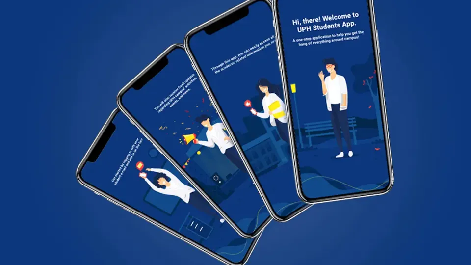

Bringing academic, campus, and financial information into one daily companion
Universitas Pelita Harapan (UPH) is a private Christian university in Lippo Village, Tangerang, managed by the Pelita Harapan Education Foundation. The university is known for introducing fully English-taught programs, a liberal arts curriculum, and multidisciplinary study in Indonesia.
UPH wanted to make daily campus life easier through a mobile application designed specifically for students. Students needed access to academic information, campus activities, schedules, grades, payments, and other updates, but these needs were often spread across different systems and moments.
Suitmedia developed UPH Mobile as a single student-facing platform. The app combined academic schedules, exams, KSM downloads, campus events, calendar planning, grades, GPA, payments, reminders, and notifications in a clear and engaging mobile experience.
Students were managing campus life through too many separate moments
1. Students already relied heavily on their phones
Mobile devices were central to how college-age users communicated, planned, and received information. Students checked their phones frequently throughout the day, making mobile access a natural channel for university services.
UPH recognized that this behavior created an opportunity. If important campus information was available through a mobile app, students could access it in the environments where they already spent time.
But mobile access alone would not guarantee value. The application needed to solve real student problems and provide a clear reason to return.
2. Academic information was only one part of the student experience
Students needed more than class schedules. They also needed exam information, grades, GPA, administrative dates, payment details, campus events, and career-related updates.
These needs came from different parts of university life. If they remained separated across systems, students could forget where to find information or miss important updates.
UPH wanted one app that could bring these areas together. The platform needed to reflect the full student experience rather than focus only on classroom activity.
3. Students needed help managing time and deadlines
University life involves many dates: class schedules, exams, administrative deadlines, payments, campus events, and other important activities.
Students may struggle to keep track of these commitments when they are distributed across different calendars, notices, or systems.
A mobile calendar and reminder experience could help students see what was coming and plan their time more effectively. This could support productivity and reduce avoidable missed deadlines.
4. Grades and GPA needed to be accessible
Academic performance information is important to students. They need to review grades, understand their progress, and monitor GPA over time.
If access is slow or difficult, students may not be able to respond quickly to academic concerns or plan future decisions.
UPH wanted the app to make this information available through a clear and private experience, allowing students to manage their academic progress more independently.
5. Financial information was part of everyday university management
Students also needed access to payment bills, payment history, and available payment methods.
Financial information can affect registration, planning, and peace of mind. Students should not need to search through separate systems or contact administrative staff for routine payment details.
Including payments in the same app made the student experience more complete and reduced the separation between academic and administrative life.
6. Campus activities needed a more visible channel
University life is shaped by more than classes and grades. Events, news, organizations, and campus activities create community and help students engage with the institution.
If students do not know what is happening, they may miss opportunities to participate. UPH needed a way to make activities and news easier to discover.
An activities feature could support a stronger connection between students and the wider campus community.
7. The app needed to be useful without feeling institutional and rigid
A campus application has to communicate important information, but it should not feel like a dense administrative portal.
UPH wanted an app with rich functionality and a design that suited its students and reflected the university’s character.
The challenge was to combine reliability and authority with a more approachable experience. Students needed to feel that the app was useful and easy to engage with.
8. One app had to handle many types of information
UPH Mobile would include academics, activities, calendars, grades, GPA, and payments.
Without careful structure, the app could become overwhelming. Students needed to find the information most relevant to them quickly rather than navigating a long list of unrelated functions.
This made information hierarchy and a straightforward user flow essential to the project.
Designing UPH Mobile around the student’s daily decisions
1. Create one mobile destination for campus life
Suitmedia developed UPH Mobile as a central platform for student information.
The app was designed to bring academic, non-academic, financial, and campus activity information into one environment.
This reduced the need for students to move between systems. The application could become a dependable starting point whenever students had a question about their university life.
2. Make Academics useful for everyday planning
The Academics feature included class schedules, exam schedules, and KSM downloads.
This brought essential academic information closer to students and reduced the need to search through separate systems or documents.
The feature supported both daily planning and important administrative tasks. Students could understand what was happening now and prepare for what was coming next.
3. Use Activities to connect students with campus life
The Activities section provided lists of campus events and news.
This gave students a clearer view of opportunities beyond their academic schedules. They could discover activities, stay informed about campus developments, and participate more actively in university life.
The feature also helped UPH communicate with students in a more direct and timely way.
4. Use the Calendar as a personal planning tool
The Calendar displayed class schedules, campus dates, and important administrative dates in a monthly view.
This helped students see different types of commitments in one place. Instead of remembering academic and administrative deadlines separately, they could view them as part of one schedule.
The calendar also supported better time management. Students could anticipate busy periods and plan their work more effectively.
5. Add a to-do perspective to academic information
The calendar included a to-do orientation around classes, important dates, and administrative requirements.
This helped turn information into action. A date on a calendar becomes more useful when students understand what they need to prepare or complete.
The feature supported productivity without requiring students to manage a separate planning system.
6. Make grades and GPA easy to access
The Grade & GPA section provided students with information about their academic performance.
Students could review grades and GPA through the app rather than waiting for access to a desktop platform or contacting an administrator.
This improved transparency and gave students more control over monitoring their progress. It also helped them make better-informed decisions about future courses and academic priorities.
7. Include payment bills and history
The Payment section included payment bills, payment history, and payment methods.
This allowed students to manage financial information alongside academic information. The app became a more complete student service rather than an academic-only tool.
Access to history also helped students review previous transactions and understand their current position without relying on separate records.
8. Use push notifications for timely reminders
Push notifications helped UPH communicate schedule reminders and updated information.
Students did not need to repeatedly open the app to check whether something had changed. Relevant alerts could draw attention to important academic or campus activity.
Notifications were designed to support the student rather than create noise. Their value came from helping students act at the right time.
9. Put an overview on the first page
The app provided a brief view of important information on the first page.
This helped students understand what required attention without navigating through every section. A good home screen can act as a daily check-in point for academic and campus life.
The overview also reduced cognitive effort. Students could quickly see what was most relevant before deciding where to go next.
10. Use UPH’s colors to reinforce identity
The app used UPH’s color palette, including blue, white, red, and yellow.
This helped the application feel like an official part of the university rather than a separate third-party tool.
Color also helped create visual consistency across the interface, supporting recognition and a stronger connection between the app and the institution.
11. Add motion and graphics to make the app approachable
To avoid making the app feel too formal or rigid, Suitmedia added motion and graphic elements.
These details helped bring energy into the experience and made the platform feel more aligned with student behavior.
The visual elements were used to support engagement without interfering with the clarity of academic and financial information.
12. Keep the user flow short and direct
A straightforward interface made it easier for students to access the functions they needed.
The app did not require users to understand a complicated structure before checking a schedule, grade, payment, or event.
This supported frequent use. Students could open the app, find an answer, and return to their day without unnecessary steps.
13. Design for the full student lifecycle
UPH Mobile was designed to remain relevant throughout a student’s time at the university.
Students could use it to plan classes, follow academic progress, discover campus activities, manage payments, and receive reminders.
This created a longer relationship between the student and the university’s digital services. The app was not limited to one administrative moment.
14. Support productivity and academic success
The application’s features were designed to help students stay organized and informed.
Schedules and calendars supported planning. Grades and GPA supported self-monitoring. Notifications supported responsiveness. Payment information supported administrative readiness.
Together, these functions could reduce avoidable friction and help students devote more attention to learning.
15. Create a foundation for future student services
The app’s structure could support additional student functions and university communication over time.
UPH could add new information, services, events, and engagement features within a familiar mobile environment.
This made the project more than a collection of initial features. It created a platform for continuing to improve the student experience.
UPH Mobile became a trusted home for student information
1. Students gained one app for daily university needs
UPH Mobile brought academics, activities, calendars, grades, GPA, payments, and notifications into one platform.
This reduced the need to search across different systems and gave students a more consistent way to manage university life.
The application became a practical companion rather than a single-purpose academic tool.
2. Academic planning became more convenient
Students could access class schedules, exam information, and important academic documents from their phones.
This improved access in everyday situations and helped students prepare for classes and exams more effectively.
The result was a more responsive academic experience, with less dependence on desktop access.
3. Students gained stronger visibility into progress
The Grade & GPA feature gave students direct access to academic performance information.
This helped them monitor progress and make decisions with better information. Students could identify areas that required attention rather than waiting for an administrative update.
Greater visibility supported student ownership of academic outcomes.
4. Campus activity became easier to discover
The Activities feature helped students stay aware of campus events and news.
This supported participation and helped strengthen students’ connection to the wider UPH community.
The app became a channel for both academic administration and campus belonging.
5. Calendar features reduced the risk of missed commitments
The monthly calendar brought classes, campus dates, and administrative deadlines into one view.
This helped students manage the complexity of university life and plan their time more effectively.
The value was practical: fewer missed dates, better preparation, and greater awareness of what was coming next.
6. Payment information became easier to manage
Students could review bills, payment history, and payment methods through the application.
This reduced uncertainty around financial obligations and allowed students to manage routine payment questions independently.
The feature also made UPH’s digital services more complete by connecting administrative and academic needs.
7. Push notifications improved student responsiveness
Reminders and updates helped students remain informed without having to check every section of the app manually.
This improved the timeliness of communication and gave students a more active relationship with university information.
Notifications also helped UPH remain present in students’ daily routines.
8. The interface encouraged repeat use
The combination of useful features, clear navigation, UPH branding, motion, and graphics made the app more inviting.
Students had regular reasons to return for schedules, grades, payments, events, and updates.
Repeat usefulness is important because a student experience app only creates value when it becomes part of daily behavior.
9. The application received strong user ratings
UPH Mobile achieved more than 4.5 ratings on both the Google Play Store and Apple App Store.
This indicated that users valued the application’s convenience and functionality.
Strong ratings also supported the university’s investment in a dedicated mobile experience. The app was not only available; it was positively received by the students it was intended to serve.
10. The platform strengthened UPH’s digital relationship with students
The app gave UPH a direct, ongoing channel for communicating with students and supporting their daily needs.
This reduced the distance between the institution and its academic community. Students could access information when they needed it, while UPH could provide updates through a more immediate channel.
The result was a stronger digital connection that supported both convenience and engagement.
11. UPH gained a foundation for future improvements
The application provided a base for adding more student services, campus features, and personalized communication.
UPH could continue improving the experience based on student feedback and usage patterns.
This created long-term value. The university gained not only a successful launch, but a platform that could evolve alongside student expectations.
12. Student experience became part of digital strategy
UPH Mobile demonstrated that digital transformation in education is not limited to online learning content.
Schedules, grades, payments, events, reminders, and communication all shape how students experience the institution.
By bringing these elements together, UPH strengthened the everyday relationship between its academic services and the students who use them.
The deeper lesson: student apps should reduce the work of being a student
1. A complete student app connects academic and administrative life
Students do not experience classes, grades, payments, events, and schedules as separate institutional departments.
A single platform can reduce the effort required to manage these connected responsibilities. The app should reflect the student’s reality rather than the university’s internal structure.
2. Daily usefulness drives engagement
Students return to an app when it helps them do something important quickly.
Schedules, calendars, grades, payments, and notifications created repeated reasons to use UPH Mobile. Engagement came from practical value, not from communication alone.
3. Overview screens help users manage complexity
A clear first page can show what matters most and reduce the need to navigate through every feature.
This is particularly useful in education, where students manage many deadlines and information types at once.
4. Notifications should support student agency
Reminders are most effective when they help students act independently.
The app should give students enough context to understand what needs attention and where to go next, rather than simply sending alerts without support.
5. Financial transparency is part of student experience
Payment information affects how students plan and participate in university life.
Making bills, history, and payment methods accessible can reduce anxiety and support more responsible academic administration.
6. Visual warmth can make institutional systems more approachable
A university app should feel trustworthy, but it does not need to feel rigid.
Brand colors, motion, and graphics can make the experience more welcoming while clear structure preserves usability.
7. Strong ratings are useful, but behavior matters more
App ratings show satisfaction, but recurring use reveals whether the platform has become genuinely valuable.
Universities should look beyond ratings to understand which features students use and how the app affects academic and administrative behavior.
8. Student apps are relationship platforms
A university app is not only a collection of services. It is a recurring point of contact between the institution and its students.
When it provides timely, useful, and accessible support, it can strengthen engagement and trust across the entire student lifecycle.
Strategic Insights for the C-Suite
- Design student platforms around the whole university experience. Academics, schedules, events, grades, payments, and reminders are connected in students’ lives. One coherent app can reduce the work required to manage them.
- Prioritize recurring practical value. Students will return when the app helps them solve everyday needs quickly. Engagement should come from usefulness, not only from institutional announcements.
- Make the first screen a decision aid. A clear overview of tasks, reminders, and important information helps students manage complexity without navigating every feature.
- Include financial information in the student journey. Bills, payment history, and methods affect academic planning and peace of mind. Financial visibility is part of student support.
- Treat the app as a long-term relationship channel. A successful launch should create a foundation for future services, personalization, and communication. Continue improving the platform through student behavior and feedback.